
Written by: Anish Rao, Head of Growth, Listen Labs
Key Takeaways
- Track 12–15 brand health KPIs across three tiers, each tied to a specific revenue outcome, inside a reusable data model with consistent grain.
- Run quantitative tracking surveys and conversational interviews in the same wave so every metric movement has an immediate qualitative explanation.
- Set alert thresholds for sentiment, awareness, consideration, and share of search, then match each stakeholder to the right cadence and format to prevent alert fatigue.
- Build three dashboard views for executives, analysts, and campaign owners so every numeric change appears next to verbatim quotes and themes from real interviews.
- Listen Labs’ Listen Pulse platform combines all four steps in one instrument; see a live demo to watch brand tracking turn into clear, actionable insight.
Step 1: Choose KPIs and Build a Reusable Brand Data Model
Most brand tracking programs measure five or six metrics. A complete program works better with 12–15 metrics across three tiers, each predicting a different revenue outcome. Tier 1 awareness metrics predict market reach and brand salience. Tier 2 consideration and preference metrics predict pipeline quality and conversion likelihood. Tier 3 loyalty and advocacy metrics predict customer lifetime value and organic growth.
The list below covers ten core metrics that deliver the strongest commercial signal for enterprise brand teams, organized by tier. Additional metrics such as brand familiarity, perceived value, or category entry points can extend the set to 12–15 based on category needs.
Tier 1: Awareness & Reach
- Unaided Awareness, respondents naming brand unprompted ÷ total respondents × 100 (Tracking survey, Quarterly)
- Aided Awareness, respondents recognizing brand after prompt ÷ total respondents × 100 (Tracking survey, Quarterly)
- Share of Search, brand search volume ÷ total category branded search volume × 100 (Search console / SEO tool, Monthly)
Tier 2: Consideration & Preference
- Consideration Rate, respondents who would consider brand ÷ respondents aware of brand × 100 (Tracking survey, Quarterly)
- Brand Preference, respondents selecting brand as first choice ÷ total respondents × 100 (Tracking survey, Quarterly)
- Purchase Intent, % likely to purchase in a defined future period matched to category cycle (Tracking survey, Quarterly)
- Trust & Credibility, % agreeing brand delivers on its promises (Tracking survey, Quarterly)
Tier 3: Loyalty & Advocacy
- Net Promoter Score, % Promoters (9–10) − % Detractors (0–6) (Survey / CRM, Monthly)
- Brand Sentiment Score, (positive mentions − negative mentions) ÷ total mentions × 100 (Social listening, Continuous)
- Equity Drivers, laddering depth scores surfacing causal preference factors (Conversational interviews, Quarterly)
Forrester’s 2025 research found that aligning brand experience and customer experience can yield up to 3.5x revenue growth. Metric selection therefore becomes a revenue decision, not a reporting preference.
A reusable data model separates these metrics by change velocity. Three core tables support most enterprise brand dashboards: brand_metrics stores your own KPIs over time, competitor_metrics stores the same KPIs for competitors so you can benchmark performance, and campaign stores the marketing activity that might explain metric movements. Together, these tables answer a practical question: did your campaign move the needle, and by how much compared to competitors?
- brand_metrics, wave_id, metric_name, segment, score, sample_n, collected_at (DATE, STRING, FLOAT, INT) refreshed per wave (monthly or quarterly)
- competitor_metrics, wave_id, competitor_key, metric_name, score, delta_vs_prior (DATE, STRING, FLOAT) refreshed per wave, aligned to brand_metrics
- campaign, campaign_id, name, status, launch_date, end_date, version (STRING, DATE, INT) refreshed on change, append-only history
Setting the grain of core fact tables before building is the most important modeling decision. This choice prevents silent metric inflation during joins and supports reliable alert logic downstream. A semantic layer that defines each KPI once above the physical tables ensures every dashboard view returns the same governed value.
Step 2: Connect Data Sources and Protect Trend Integrity
A well-designed data model is necessary but not sufficient, because it must be fed by data sources that maintain trend integrity over time. A brand tracking dashboard fails when its data sources drift. Brand health tracking should run quarterly as the default for brands spending $2 million or more annually on marketing, using identical methodology each wave to produce comparable trend data. Faster-moving signals such as sentiment, share of search, and branded search volume work better with monthly or continuous feeds.
The structural problem with many traditional trackers is that quantitative and qualitative data arrive separately. A consideration score drops four points, then a separate qualitative study is commissioned weeks later. When a quantitative tracker flags an unexpected metric movement, an event-triggered qualitative study should launch within one week and be briefed around the specific diagnostic question raised by the data, with findings returned in 24 hours via 50–100 AI-moderated depth interviews.
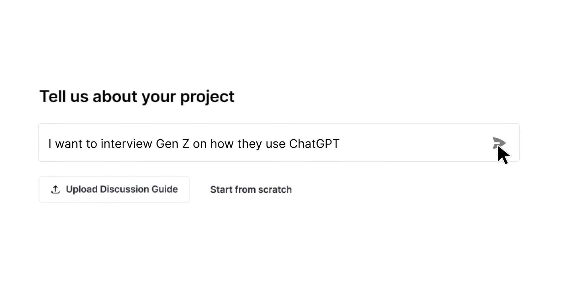
Listen Pulse removes that lag by running structured tracking questions and open-ended conversational interviews in the same wave. Quantitative responses populate the brand_metrics table defined in Step 1, while conversational themes flow into a parallel qualitative_themes table keyed by wave_id and metric_name. Every numeric movement in the dashboard then links directly to the interview excerpts that explain it. Core questions stay constant wave over wave to protect the trend line. Timely add-on questions cover new campaigns, competitors, or news events without breaking historical comparability. The platform integrates with Qualtrics and Decipher, so teams keep the KPIs they already report while adding the narrative behind them.
Quantitative trackers alone leave metric movements strategically ambiguous. An awareness score rising from 68% to 71% cannot be attributed to a campaign, word-of-mouth, news coverage, or competitor withdrawal without qualitative diagnosis. Each cause requires a different response, so the explanation matters as much as the movement.
Step 3: Set Alert Rules and Map Escalation Paths
Alert logic turns passive dashboards into decision triggers. The thresholds below are starting points, and most teams over-alert initially. A monthly review then separates signals that drive action from noise that clutters inboxes. The following thresholds represent the minimum movement required to trigger action for each metric; use them as a baseline, then adjust based on your brand’s volatility and stakeholder tolerance for alerts.
- Brand Sentiment Score, negative sentiment exceeds 30% over 24 hours, immediate team notification, crisis playbook review
- Unaided Awareness, drop of 3 or more percentage points wave over wave, brand manager review within 48 hours, qualitative brief triggered
- Consideration Rate, drop of 4 or more points over two consecutive waves, insights lead review, 50–100 depth interviews launched within one week
- Share of Search, loss of 3 or more percentage points to a single competitor in a quarter, competitive intelligence review, messaging audit
- Share of Voice, swing of 5 or more points week over week or 10 or more points in a quarter, weekly internal check, media spend review
Any mention pairing the brand with terms such as “lawsuit,” “recall,” or “investigation” should generate an immediate alert. A hostile mention from a verified account with 10,000 or more followers warrants assessment within 30 minutes. Different stakeholders need different cadences because their decisions operate on different clocks. Map each stakeholder to a specific cadence and format before defining thresholds. A CEO receives weekly summaries, while a crisis team receives real-time alerts.
Reputational damage on social can depress purchase consideration before it impacts sales, which creates an intervention window for teams monitoring continuously. Alert systems that route routine mentions to daily digests while reserving immediate alerts for high-impact triggers prevent the fatigue that causes teams to ignore signals entirely.
Step 4: Design Role-Based Dashboards That Close the “Why” Gap
A single dashboard layout rarely serves every audience well. Three views, executive, analyst, and stakeholder, each apply a different scan rule and information hierarchy.
The executive view follows a five-second scan rule. It shows one headline metric per brand health tier, awareness, consideration, and sentiment, a trend sparkline for each, and a single qualitative theme explaining the largest movement this wave. It excludes tables and raw data.
The analyst view exposes the full brand_metrics and competitor_metrics tables with wave-over-wave delta columns, segment breakdowns, and alert status flags. Every numeric movement links to the conversational theme panel that explains it.
The stakeholder view is campaign-scoped. It shows only the metrics relevant to a specific launch or initiative, with pre- and post-campaign deltas and verbatim quotes from the wave conducted after launch.
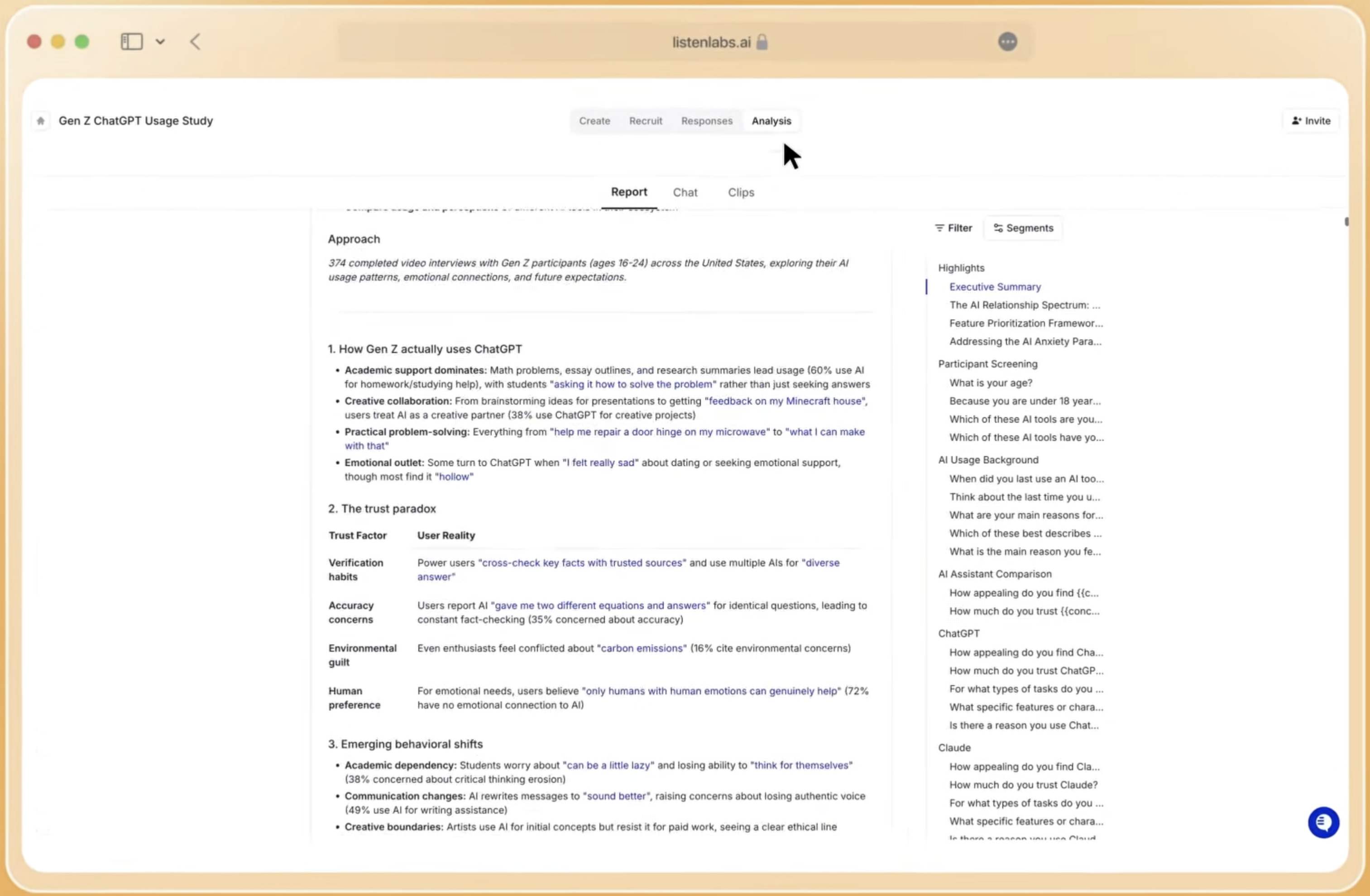
The “why” gap is the structural failure of traditional brand trackers. Traditional agency brand trackers typically deliver results in several weeks per wave but provide limited qualitative explanation of why metrics shift. Listen Pulse closes that gap by charting emerging themes from open-ended conversations directly next to the KPIs teams already report. Every number traces back to a real interview, a verbatim quote, and an audio or video clip. One well-known clothing brand, famous for its big logos, was quietly losing customers. Its old tracker caught the drop but could not explain it. Pulse found it was not price; it was style. A growing group of customers felt the big logos were too loud for their changing lifestyles.
Troubleshooting Common Brand Dashboard Failures
Three problems account for most brand tracking dashboard failures after launch:
- Data quality degradation. Poor data quality, undocumented data sources, and mid-project changes to metric definitions are the factors that most consistently add weeks to dashboard timelines. Establish a data dictionary before the first wave and version-control every metric definition change. When a definition changes, append a new column rather than overwriting historical values. This practice protects the data model from silent breaks described in Step 1.
- Alert fatigue. Not every mention should trigger an immediate alert, route routine mentions to daily or weekly digest emails while reserving immediate alerts for high-impact triggers. Schedule a monthly review of alert effectiveness and retire thresholds that consistently produce noise without generating action. This review keeps the alert system from Step 3 usable over time.
- Trend integrity breaks. Adding new questions mid-program without flagging the wave breaks historical comparability. Listen Pulse handles this by keeping core questions constant while isolating timely add-on questions in a separate module that does not affect the trend line. When integrating with an existing Qualtrics or Decipher tracker, map new fields to the existing schema before launch rather than after the first wave returns. This discipline preserves the trend integrity established in Step 2.
Frequently Asked Questions
What is the typical timeline to launch a working brand tracking dashboard?
A mid-complexity BI dashboard connecting multiple data sources with custom metrics, role-based views, and alert logic typically takes 4–12 weeks to build from scratch. The data pipeline phase, extracting, cleaning, transforming, and loading data, accounts for a significant portion of that time. Teams using Listen Pulse alongside an existing tracker can compress this significantly because the data model, wave structure, and qualitative integration are pre-built. The primary variable becomes internal approval cycles and data access, not platform configuration.
What cost ranges should teams expect for a custom versus conversational tracker?
Traditional agency brand trackers typically require substantial investment for multiple waves, with results delivered in several weeks per wave. Enterprise panel tracking from providers like YouGov BrandIndex delivers daily quantitative data but no qualitative explanation of why metrics change. Survey subscription tools provide options for continuous quantitative dashboards. AI-moderated conversational tracking programs deliver depth interviews with qualitative theme analysis within 24 hours. As noted in Step 2, traditional trackers require several weeks per wave, and hidden labor costs, panel management, report production, and account management, can substantially inflate the total cost.
How do compliance requirements affect data collection and storage?
GDPR, SOC 2 Type II, ISO 27001, ISO 27701, and ISO 42001 requirements affect three areas of a brand tracking dashboard. These areas are participant consent and data residency for survey and interview data, access controls and encryption for the metrics warehouse, and retention policies for verbatim quotes and video clips. Listen Labs holds all five certifications, uses 256-bit encryption, and never trains its AI models on customer data. Teams operating in the EU must confirm that their quantitative panel provider and any third-party BI tool also meet GDPR data residency requirements before connecting them to a shared dashboard schema.
When should a team expand or retire an existing brand tracker?
Expand a tracker when a new market, segment, or competitor requires coverage that the current wave structure cannot accommodate without breaking historical comparability. The correct approach is to add a parallel module rather than modifying core questions. Retire a tracker when the metrics it reports have no documented connection to a business decision made in the past four quarters, or when the cost of maintaining trend integrity across waves exceeds the strategic value of the trend line. A tracker that reports KPI movement without any diagnostic for why the movement occurred is a candidate for replacement with a conversational tracker that pairs every metric with an explanation.
Conclusion: Using One System to Close the Brand “Why” Gap
Building a functional brand tracking dashboard requires four sequential decisions that together close the “why gap,” the structural failure of dashboards that report that a metric moved without explaining why. First, define KPIs and a data model that separate metrics by change velocity, as described in Step 1. Second, integrate quantitative and qualitative data in the same wave so every number has an immediate explanation, as described in Step 2. Third, configure alerts that route the right signal to the right stakeholder at the right time, as described in Step 3. Finally, design multi-view layouts that pair every metric with the conversational themes behind it, as described in Step 4. Each step builds on the previous one: the data model enables integration, integration enables diagnostic alerts, and alerts feed role-specific dashboards that turn metric movements into decisions.
As discussed in Step 4, traditional trackers report that a metric moved but not why. This pattern forces reactive decisions and separate qualitative studies that arrive too late to inform the response. Every time a dashboard shows a significant KPI movement, qualitative research should be triggered before designing any fix. This practice prevents action based on numbers alone.
Listen Pulse delivers both the number and the reason behind it in the same wave, with every finding traceable to a real interview, a verbatim quote, and a clip. It deploys alongside an existing tracker or as the primary tracking system, integrates with Qualtrics and Decipher, and keeps core questions constant so the trend line stays clean while timely questions cover new campaigns and competitors.